Lucy Whitmore Preliminary Task
To see my AS Media Music Magazine blog, please click the blog page located at the top right. Or click this link. http://lucywhitmoremedia.weebly.com/as-media-music-magazine

Here I am going to be updating my blog for my AS media course. I have been assigned to write one about a magazine which is one of the rather old 'Look' magazines and I will explore the dimensions of the front cover and how it is effective.
The masthead is one of the most important parts of the magazine which is located largely at the top left of the page. It is clear the masthead appeals to women; women tend to find the way they look more important than men would and it's almost stereotypically created. Here the word 'Look' is in a large pink font and some the letter K is covered by the celebrity on the front cover.
Next, onto the celebrity, this one has a picture of Rihanna who is a famous singer, this immediately will draw the attention of fans of her music and may attract people who even know of her. Rihanna's name is actually stated below the picture largely and boldly which again is used for the attraction. There are also other names included such as Kimberley, Cheryl, Ashley, Georgina Mary, Mark Heyes and so on.
There are many small photos included especially in the corners of the magazine, it has pictures of other celebrities who are not just music celebrities, there are different types, this will attract ranges of people rather than just Rihanna fans. There are also pictures of clothes, bags and shoes which suggest this also contains fashion tips, so this is not only a gossip magazine, it does include fashion tips etc which broadens the ranges of women to buy this.
The colour scheming in this is very strong, it has uses of pastel pinks and blues on the background and this associates it more with women which means it won't attract men to buy it. The font is very bold and clear to read. Some words are actually used in caps such as NEW which is a bold way in attracting attention.
There are persuasive phrases included such as: "100 best ever expert fashion& beauty tips!" and "Hottest new high street label ever!" There is a rhetorical question used, "Forced into rehab?" which will make the reader question whether this information is true and may make them want to read about it and buy the magazine. There are also some hyperbolic words like "Dangerous","Best ever", "crisis" and so on which a used to either shock the reader into exploring the drama within the pages or persuade them again.
What appear to be free gifts are also included, yet rather than actual gifts it states, "Trend tip off's!" and lots of information about fashion tips which are in this magazine, this attracts people who love the latest styles and generally female shoppers.
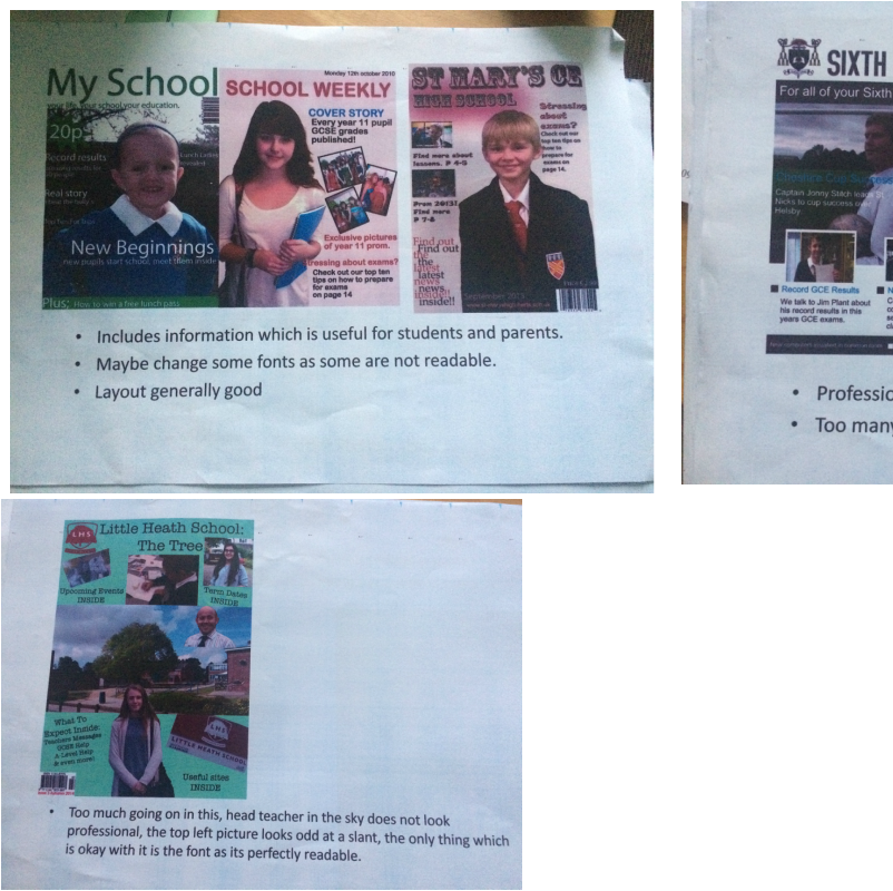
Here are some annotated school magazine pictures I have collected, I have made comments about what I like and what I'd change. This is very useful for me for when I create my magazine as I can establish what I should and shouldn't do. I have decided the colour schemes must be similar to the schools colours which are green and gold. I like the sixth sense magazine yet it looks more like a news letter. However it is very smart and looks professional.
I am going include a barcode and the schools website which is common on magazines, especially the website which is mainly a new add on magazines as it gives people access to more information which is important.
My golden third will include information which attracts more pupils than students as my magazine revolves around a student guide.
The masthead is one of the most important parts of the magazine which is located largely at the top left of the page. It is clear the masthead appeals to women; women tend to find the way they look more important than men would and it's almost stereotypically created. Here the word 'Look' is in a large pink font and some the letter K is covered by the celebrity on the front cover.
Next, onto the celebrity, this one has a picture of Rihanna who is a famous singer, this immediately will draw the attention of fans of her music and may attract people who even know of her. Rihanna's name is actually stated below the picture largely and boldly which again is used for the attraction. There are also other names included such as Kimberley, Cheryl, Ashley, Georgina Mary, Mark Heyes and so on.
There are many small photos included especially in the corners of the magazine, it has pictures of other celebrities who are not just music celebrities, there are different types, this will attract ranges of people rather than just Rihanna fans. There are also pictures of clothes, bags and shoes which suggest this also contains fashion tips, so this is not only a gossip magazine, it does include fashion tips etc which broadens the ranges of women to buy this.
The colour scheming in this is very strong, it has uses of pastel pinks and blues on the background and this associates it more with women which means it won't attract men to buy it. The font is very bold and clear to read. Some words are actually used in caps such as NEW which is a bold way in attracting attention.
There are persuasive phrases included such as: "100 best ever expert fashion& beauty tips!" and "Hottest new high street label ever!" There is a rhetorical question used, "Forced into rehab?" which will make the reader question whether this information is true and may make them want to read about it and buy the magazine. There are also some hyperbolic words like "Dangerous","Best ever", "crisis" and so on which a used to either shock the reader into exploring the drama within the pages or persuade them again.
What appear to be free gifts are also included, yet rather than actual gifts it states, "Trend tip off's!" and lots of information about fashion tips which are in this magazine, this attracts people who love the latest styles and generally female shoppers.
Here are some annotated school magazine pictures I have collected, I have made comments about what I like and what I'd change. This is very useful for me for when I create my magazine as I can establish what I should and shouldn't do. I have decided the colour schemes must be similar to the schools colours which are green and gold. I like the sixth sense magazine yet it looks more like a news letter. However it is very smart and looks professional.
I am going include a barcode and the schools website which is common on magazines, especially the website which is mainly a new add on magazines as it gives people access to more information which is important.
My golden third will include information which attracts more pupils than students as my magazine revolves around a student guide.
I have came up with a new name as the magazine cover I have sketched is a draft and I'm constantly changing ideas. So far I've not confirmed the colour schemes yet but I am thinking of the classic dark green font like our logo, but I'll have to see whether it works with my photo or not. I'm going to discuss more about that when In design is accessible. The title I've decided on is EBA Student as the magazine will revolve around the Eaton Bank students. The golden third I think will have useful information such as about GCSE results, exciting events and trips, exam stress tips and so on. On the strapline I'm thinking of including an exclusive which interests the reader such as "Exclusive prom pictures 2016!" And include the website which gives students the option of looking into the school more. (I will upload a picture of this when my phone lets me and go through it in more depth)
Here are photos I am thinking for my magazine I have taken. So far I personally like these two angles the most out of the photos I have taken. The top one shows how the schoo looks smart and modern. My model would look directly at the camera in the real shot, these are just basic ideas. In the second shot I would crop the cars out and concentrate more on the pupil and the arch of trees for it to work, also the image looks slightly slanted which isn't a good thing.
Here are photos I am thinking for my magazine I have taken. So far I personally like these two angles the most out of the photos I have taken. The top one shows how the schoo looks smart and modern. My model would look directly at the camera in the real shot, these are just basic ideas. In the second shot I would crop the cars out and concentrate more on the pupil and the arch of trees for it to work, also the image looks slightly slanted which isn't a good thing.

Here are one of the photos I took I may have the model more closer to the school buildings in this one and I may not have cars in the picture so I could go on a Saturday where there are no cars. The trees create a nice arch. Yet I'd probably position the camera slightly differently.

I like this photo as it shows the schools whole building and complex architect. However the model looks like it has been edited in so I might experiment with my photography to see if I can eliminate this issue.

Here is my ideal layout for my school magazine. The mast head which I have decided on is called "EBA Student" The masthead is going to be in a bold font and will be eye catching. As you can see I've covered some of the title with the pupils head which is effective as well as it draws the person to looking at different parts of the magazine. I have included the school logo on the left corner with the website underneath. As you can see my golden third is located on the left however I am debating on adjustments. For example I may not include as many sections which are related to exams as two of them already are very similar. I'd also remove that extra exclamation mark. Also where I have put "Exclusive prom pictures" I'm not sure whether to put that as part of my golden third and change it to something about meeting the teachers. I am aiming this magazine towards students which is clear in the title but by the golden third and parts of it make that obvious as these are the types of things which a student would be expecting. For the colour schemes I am going to be using green and gold as this represents the schools logo and its chosen colours.
Generally I am going to make slight adjustments in the process of this. |
I have now created a questionnaire for people to give me feedback on what should be on the front pages of a magazine and so on. I will be collecting the data and then analyse and compare my results. Here is the link to my questionnaire:
https://www.surveymonkey.co.uk/r/DSX7XT8
I have used many different types of questions for this, such as open and closed. open questions are good as uexpected answers which can include more detail which allows me to gain new insights and changes which I can make. However it may be tricky to analyse as people can put completely different answers, so I'll have to take this into consideration. Closed questions produce quantitative data, this is easier to analyse as they're restricted to selecting certain responses and I can easily record for example how many people put 'yes' rather than 'no' and so on. However there are issues such as it may not represent their true feelings or behaviours.
I have collected the results for my questionnaire, 87% of people asked said that the magazines picture would look best with a picture of the student and the school. This is what I have done and I have included the schools new architect. For question 2, 75% said I should include a schools website on the front page, I have done this under the eaton bank logo. For question 3, this was more of an open question on how much a magazine should cost. Many said £1.50 which is what I decided on. 85% of people said the masthead should be covered by the main picture, I went against this because it was too complex to edit on publisher. On question 5 I went against this as well, as I asked what colour scheme should be used and many said “green and yellow” which is the schools colours, yet when I did this it was too hard to match the two shades of green and it looked very boring so I decided not to do that. On question 6, 85% of people said include a barcode which I have. On question 7 90% of the people agreed that the magazine should be targeted at parents as well as students, I went against this as it was much more complicated to aim it at them as well as it may have to include different information which varied from the student.
Here are some of the pictures I have taken for my final magazine. Some of them I prefer more than others as one of them has an extremely bright flash on the pupils face, yet I thought I would include it on my blog
Below you can see my final design for my school magazine. I have used a cool pink box for the title which I think looks rather professional and so does the mastheads font. The only thing I was not thrilled about was the golden thirds text. This is just because I think it is still hard to read even when it is in white and the font is still small so this is something I must remember when making my music magazine. I liked the photo picked as it shows the school and the pupil. The contents page does look smart, however it looks a bit boring as I just put lots of page numbers and sentences all bunched together. That didn't look very appealing, especially to students.
Below you can see my final design for my school magazine. I have used a cool pink box for the title which I think looks rather professional and so does the mastheads font. The only thing I was not thrilled about was the golden thirds text. This is just because I think it is still hard to read even when it is in white and the font is still small so this is something I must remember when making my music magazine. I liked the photo picked as it shows the school and the pupil. The contents page does look smart, however it looks a bit boring as I just put lots of page numbers and sentences all bunched together. That didn't look very appealing, especially to students.
Evaluation:
My magazine has challenged the conventions of most magazines, mainly because it is not as busy as a general magazine which is crammed with information or gossip. However there are many elements I have included which are similar to a usual magazine, such as the golden third, the exclusive part located at the bottom, the barcode, price and so on which I had to research into in order to make these decisions. The contents page is slightly more plain, I think I could've made the page numbers bigger which is common in most magazines. My media product represents particular social groups as it states valid information to a person who would read this. It suits many types of social groups such as sixth formers as well as new students yet this magazine is not targeted at parents however it contains information a parent would be interested in. Generally the target audience is pupils as it states information which would be useful to them such as for A level students there is a page called "A level preparation" yet I could still argue that parents could read any of this information. This magazine attracted people because of the colour scheme, I decided to go against the green and yellow colours just because the colour I used actually stood out more and looked incredibly professional with the font used and so on. The golden third contains three of the most useful information I think that a pupil or sixth form student would want to read about, such as the exam tips, it is crucial for pupils to do well in exams. Overall, I have learnt that making this product was a lot harder than I imagined, especially when using publisher as the layout was difficult to construct. And actually taking my final photo was difficult as the angle had to be correct and it took me a few attempts until I got the right one. What I found extremely hard was putting all text I wanted to on the magazine and the contents, because in order to fit it all in, the font had to be extremely small, which I thought would not be readable, so there were a lot of difficulties I had to address in this process, I learned to make the font slightly smaller but cut the vast amount of text I wanted to include away.
My magazine has challenged the conventions of most magazines, mainly because it is not as busy as a general magazine which is crammed with information or gossip. However there are many elements I have included which are similar to a usual magazine, such as the golden third, the exclusive part located at the bottom, the barcode, price and so on which I had to research into in order to make these decisions. The contents page is slightly more plain, I think I could've made the page numbers bigger which is common in most magazines. My media product represents particular social groups as it states valid information to a person who would read this. It suits many types of social groups such as sixth formers as well as new students yet this magazine is not targeted at parents however it contains information a parent would be interested in. Generally the target audience is pupils as it states information which would be useful to them such as for A level students there is a page called "A level preparation" yet I could still argue that parents could read any of this information. This magazine attracted people because of the colour scheme, I decided to go against the green and yellow colours just because the colour I used actually stood out more and looked incredibly professional with the font used and so on. The golden third contains three of the most useful information I think that a pupil or sixth form student would want to read about, such as the exam tips, it is crucial for pupils to do well in exams. Overall, I have learnt that making this product was a lot harder than I imagined, especially when using publisher as the layout was difficult to construct. And actually taking my final photo was difficult as the angle had to be correct and it took me a few attempts until I got the right one. What I found extremely hard was putting all text I wanted to on the magazine and the contents, because in order to fit it all in, the font had to be extremely small, which I thought would not be readable, so there were a lot of difficulties I had to address in this process, I learned to make the font slightly smaller but cut the vast amount of text I wanted to include away.
