Looking back at your preliminary task what do you feel you have learnt in your progression from it?5/4/2017 In terms of pre-production, I feel my time management skills have improved since the preliminary task; since then I have been more organised with conducting photo shoots, collecting results from questionnaires and sticking to deadlines. In the preliminary task, I was not able to allow myself ample evaluation time and the quality of my work was mediocre. I did not ask for any feedback or spend time in the planning process for the preliminary task. For example, I did not gain any feedback from my peers on my photos or feedback on the production process. I realised throughout the process, feedback from my target audience is crucial to help me make decisions and illustrate what the audience desire and would make them engage with my media products, which is very important. I have found that if I work efficiently and spend more time doing Media Studies, I am able to evaluate my work a lot more easier and understand my products benefits. If I did not do enough research into different pop magazine brands and analyse different media products then it wouldn’t give me options and ideas for constructing and therefore my final products would not be ineffective. In order to plan to succeed, the research I did helped my progress throughout this process when looking at broader ideas and eventually making sure my products engaged and targeted my audience correctly.
I have progressed enormously with the technology and construction of my final products. In my preliminary task, I did not use In-Design to create my final products, I used Publisher. This definitely restricted my ability to create professional products and created something which looked satisfactory. In Publisher, I could not edit my images or enhance them in any meaningful way. I was restricted to using only a number of fonts which my target audience could not choose in questionnaires. Also as editing in Publisher is extremely minimalistic, my contents page was very boring and dull compared to the product I have created now. My final product looks professional in the fact that I have included different fonts on different sections, this adds clarity to my work. My final product is definitely more structured as I created margins and guidelines to help me with a balanced structure and it guided me for where I could draw my text and photo boxes. With my final products, I had conducted research like questionnaires to help me decide what to do. Without these editing softwares, I would definitely have struggled to create layouts expected from my target audience and the draft I designed. My target audience also helped me decide on colour schemes, appropriate fonts and so on. As I previously stated in my preliminary task, I was unable to do this so therefore that task struggled to conform to that specific target audience which means it would’ have been less effective and less engaging. My photography skills have improved significantly. After the preliminary task, I arranged photo shoots with people who were suitable for my magazine. I learnt about the different camera shots such as using: close ups, mid shots, long shots and what the effect was of this. By understanding what effect this gives to the audience, I could establish which one would work best. In my preliminary task, I just took a few pictures and picked one that looked good. This is very unprofessional. By improving this, I conducted different photo shoots and followed my photo shoot plan document. This saved time as I knew exactly what I needed to do, yet I also left myself spare time by doing a few experimental shots. One thing I struggled with in the preliminary task was getting feedback from peers in my class and on social media. Feedback is valuable information that will be used to make important decisions. I got feedback on my front cover and on social media forms like Facebook. I also gained feedback on my article draft for my final double page spread. My teacher helped correct any grammatical errors. Teachers can help me amend any errors which I can learn from and especially since my target audience would see my media products, it was important that there were no errors. Overall, I have developed throughout the process of my AS year. I became more organised and perceptive which helped me with researching, constructing and designing my final products.
0 Comments
Here is a response to the question. I used Sony Vegas Platinum to construct this video. Below is a screenshot of the process. 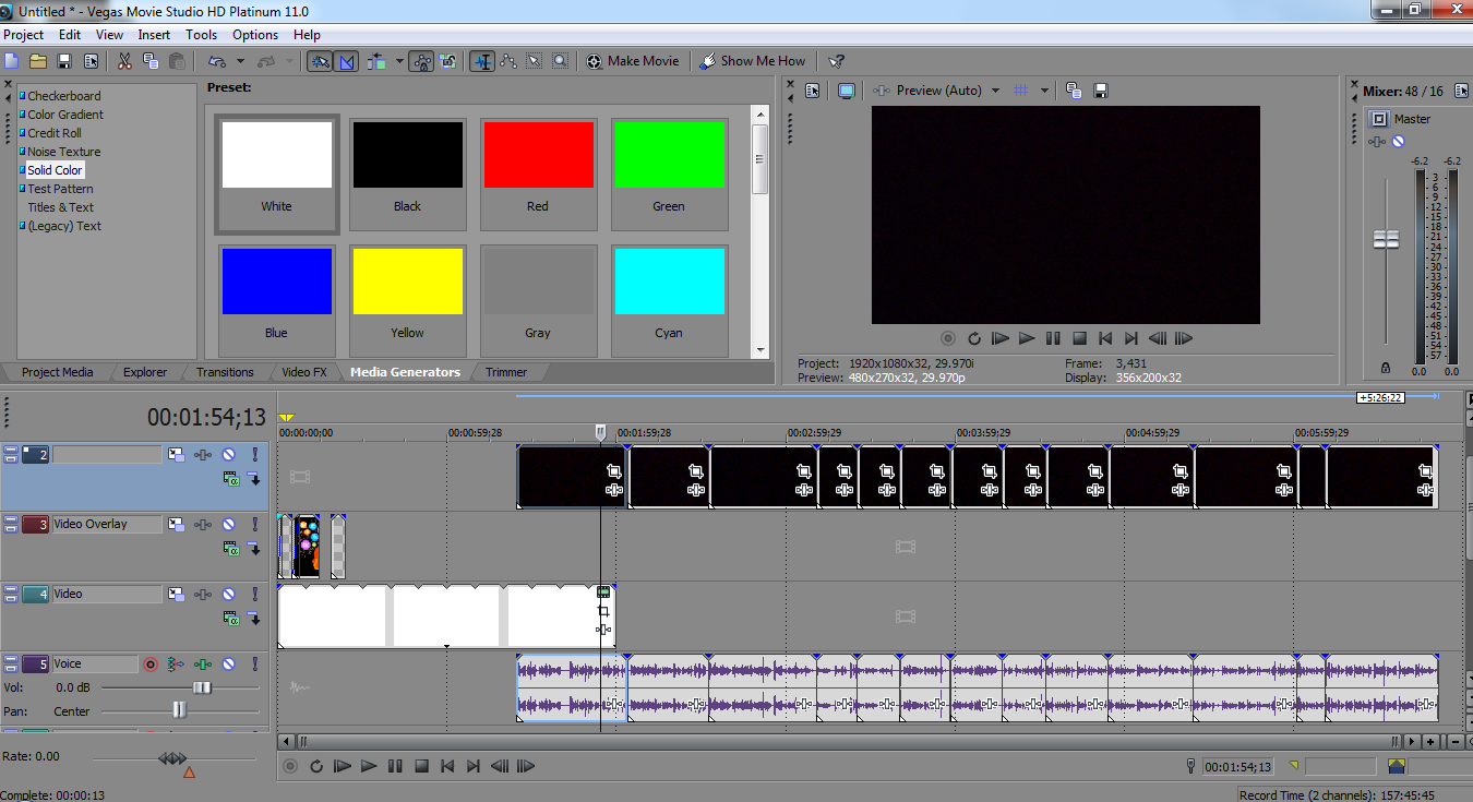 Addressing my audience was crucial throughout the process of this course. A way in which I addressed my audience was by conducting questionnaires. For example 70% of my target audience preferred the name 'The Chart' for my magazine masthead. I made decisions based on what would attract my target audience. All the feedback I got, I used in order to construct the suitable invention.
Specifically, I used a range of features which attracted my audience in my magazine. For example the language was key. By using a mixture of colloquial and formal language, it grabbed their attention and this allowed the audience to understand it better as it was more familiar to them. If I designed my magazine to be very high register (very formal), my target audience would not understand the language because my lexical choices may have been too complicated and they may even find the magazine boring. Therefore, by using simpler language, it enabled my audience to connect with my products and feel a sense of belonging as it is only targeted at a specific age category. Informal/colloquial language is evident on my contents page. For example words like ‘fresh’ and ‘heading down’ made my magazine suit my intended audience. However, it was important that I wasn’t too informal because I was targeting a specific age category that would have been in education or still in education. My target audience was not young children, so I tried to keep an expected level of formality throughout the process; I generally used a range of vocabulary which fitted this. My fonts were significant in attracting my audience. On my front cover, my masthead was very bold and engaging. The font also colour complemented my background; this was very important as it meant my products were visually and aesthetically pleasing. This meant my audience were more likely to engage into my product as it was very satisfying. As I previously stated, I conducted a questionnaire which helped guide me on what my target audience would like to see. I included an interview as the main article which was decided by 80% of people. Feedback like this definitely would attract them because their feedback helped me create my products to suit them. The images I used really engage the audience as the image on the front cover is a young female artist who fits the target audience age category. This would make the audience want to read and feel involved in this popular artists lifestyle. Also in my front cover, my model is looking directly at the camera. This is a direct mode of address which makes it more personal and the audience will feel enticed. Female models are also used among the contents page and double page spread. In the contents page the models are different people but will attract the female audience as they will see them as a role model and very influential. All these small features I have done like conducting photo shoots and drafting, all attract and persuade my target audience to admire my products. Mis en scene helped me address my target audience as I picked stylish, fashionable clothes which are commonly worn in society. This gave my target audience a sense of belonging and equality. Also by using modern clothes it would more likely attract the female audience. The lighting used on some images were more artificial, this made my images more flawless and pleasurable. The red lipstick on my front cover appealed to my audience the image looked more stylish and elegant. Similarly, like the colour scheme, it contrasted nicely with the blue/teal background gradient. Finally, I published my products among the social media form Facebook. This allowed my audience to interact and give me feedback about my media products. The feedback I received has been posted on a blog. I have created a PowerPoint which I uploaded to the website slideshare to answer this question. Please click the following link to read my response.
There are a few key social groups in which my media product belongs too. The group of people my music magazine is trying to attract is those in the 16-25 age category, (young adults) who are interested in the pop music genre.
Social class- My products would predominantly represent the Middle Class, this is mainly because of the mis en scene used. For example, the clothing worn by the artists featured in the magazine wear fashionable/trendy clothes however it is still very casual, which is why it would not appeal to the upper class group. In particular, I have to remember that magazines are not entirely cheap and are represented as more exclusive to people with surplus income. My product itself, has features which represent the young adult social group. For example, I used a young female artist throughout my media products. The young female artist represents my social groups as they will be similar ages and therefore the younger age category will feel a sense of equality and belonging and can relate to the artist. The colour scheme is not exotic or colourful. It is very minimilistic which matches the design ethos young professionals in society. My media product follows very similar conventions that conform to my genre of magazine. For example, I have focused on a range of front covers, contents pages and double page spreads which are all in the Pop music genre. A media brand which I was particularly focused on was Billboard and Clash. I decided throughout the planning of my research, I really liked the sophisticated, engaging style of the magazine. In order to follow similar conventions, I observed a range of Billboard’s front covers and content pages which enabled me to make decisions and pursue a similar product. Firstly, for my front cover, I established which Billboard front cover I liked most. This was based on personal preference and results from a following questionnaire. When I looked at examples of Billboard front covers, I noticed the Taylor Swift artist cover was elegant. It had a very simple/minimalistic layout and 90% of my target audience also believed a simple layout convention would look best. 60% of my audience said a strapline would not attract them to reading my magazine; this emphasises why I thought the simple layout approach was best and why I concluded the Taylor Swift Billboard front cover would be well suited. I used a blue/teal background colour and brighter, similar fonts which made my magazine which added clarity and made my look polished. I followed the exact positioning of the fonts and layout design. However, I chose my own artist name and text which complemented my colour schemes like the front cover I was following. For my contents page, I looked at many different Billboard contents pages, most of which had similar layouts; the only major difference I noticed were that some content pages included a chart section and others did not. My magazine masthead was called ‘The Chart’, I therefore felt it was necessary to include information about the latest charts like songs and albums hence why I followed patterns of Billboard’s contents page which had a chart table. This would help me appeal to my target audience and represent the idea that Pop music is mainstream and it has a large genre which constantly has a growth in new music. Another way in which I challenged real media products was by the literal text I used. I noticed in Billboard contents pages; they used very sophisticated vocabulary and covered wider issues not just about literal music. I decided to use original ideas such as I created my own festival in the events section even though Billboard did not do this. I thought I should be original but significantly, I remembered who my target audience is and who the product is aimed at. So I used less complex vocabulary throughout, including on the double page spread. For my double page spread, I researched many different music double page spreads, not just the Billboard double pages. This was because during my researching, I looked at different types of constructions and colour schemes. I also decided to use an interview as the article which meant I had a limited range of magazine double page spreads I could follow. I decided to change specific font colours for the interviewer text, which was common in all interview-based articles. One significant way in which I challenged the conventions of real media products was that I chose to follow the simplistic form throughout the production process. This form is different to typical magazines which have an extremely busy layout such as- We Heart Pop or Top of the Pops. These are both pop magazines which attract audiences by creating a busy layout with the latest music, fashion and gossip. I think it was important I didn’t follow these pop magazines because I noticed these specific magazines were more old-fashioned and outdated such as, Top of the Pops was launched in February 1995. Evidently, a lot of content like gossip and fashion are illustrated on Social Media like magazine websites Billboards for example have their own website where they can add information without having to create a busy, overcrowded magazine. I thought it was best if I followed the latest convention rather than old products. Overall, I followed very similar conventions to the pop music genre magazines like Billboard and Clash so my final construction products would look efficient and I also challenged aspects in order to appeal to conform to the modern, sophisticated media products. Here is a range of feedback I got my following designs. I asked people from the age of around 16+ of both sexes using the 'Facebook Messenger' app. I sent this copied message to a range people that did not take the subject Media Studies. This was to simply find out what people's honest opinions were. Many individuals used abbreviations of words. Below are the meanings. tbh- to be honest. v= very
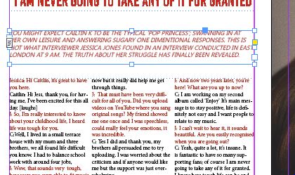
Here is my finished double page spread without the guidelines/margins. 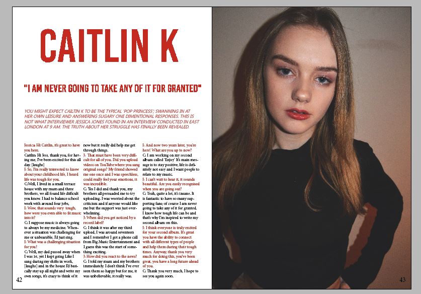  |
AuthorWrite something about yourself. No need to be fancy, just an overview. Archives
May 2017
Categories |
My Site


 RSS Feed
